-
Python/python-pptx 사용자 가이드 - 11. Charts코딩/Python 2024. 6. 12. 15:12728x90
https://python-pptx.readthedocs.io/en/latest/user/charts.html
Working with charts
python-pptx supports adding charts and modifying existing ones. Most chart types other than 3D types are supported.
python-pptx는 차트 추가 및 기존 차트 수정을 지원한다. 3D 유형을 제외한 대부분의 차트 유형이 지원된다.
Adding a chart
The following code adds a single-series column chart in a new presentation:
다음 코드는 새 프레젠테이션에 단일 계열 세로 막대형 차트를 추가한다.
from pptx import Presentation
from pptx.chart.data import CategoryChartData
from pptx.enum.chart import XL_CHART_TYPE
from pptx.util import Inches

# create presentation with 1 slide ------
prs = Presentation()
slide = prs.slides.add_slide(prs.slide_layouts[5])

# define chart data ---------------------
chart_data = CategoryChartData()
chart_data.categories = ['East', 'West', 'Midwest']
chart_data.add_series('Series 1', (19.2, 21.4, 16.7))

# add chart to slide --------------------
x, y, cx, cy = Inches(2), Inches(2), Inches(6), Inches(4.5)
slide.shapes.add_chart(
    XL_CHART_TYPE.COLUMN_CLUSTERED, x, y, cx, cy, chart_data
)

prs.save('chart-01.pptx')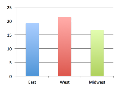
Customizing things a bit
The remaining code will leave out code we’ve already seen and only show imports, for example, when they’re used for the first time, just to keep the focus on the new bits. Let’s create a multi-series chart to use for these examples:
나머지 코드는 우리가 이미 본 코드를 생략하고, 예를 들어 처음 사용될 때 새로운 부분에 초점을 맞추기 위해 가져오기만 표시한다. 다음 예에 사용할 다중 계열 차트를 만들어 본다.
chart_data = ChartData()
chart_data.categories = ['East', 'West', 'Midwest']
chart_data.add_series('Q1 Sales', (19.2, 21.4, 16.7))
chart_data.add_series('Q2 Sales', (22.3, 28.6, 15.2))
chart_data.add_series('Q3 Sales', (20.4, 26.3, 14.2))

graphic_frame = slide.shapes.add_chart(
    XL_CHART_TYPE.COLUMN_CLUSTERED, x, y, cx, cy, chart_data
)

chart = graphic_frame.chart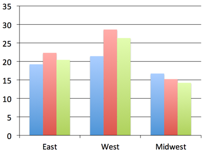
Notice that we captured the shape reference returned by the add_chart() call as graphic_frame and then extracted the chart object from the graphic frame using its chart property. We’ll need the chart reference to get to the properties we’ll need in the next steps. The add_chart() method doesn’t directly return the chart object. That’s because a chart is not itself a shape. Rather it’s a graphical (DrawingML) object contained in the graphic frame shape. Tables work this way too, also being contained in a graphic frame shape.
add_chart() 호출에서 반환된 도형 참조를 graphic_frame으로 캡처한 다음 차트 속성을 사용하여 그래픽 프레임에서 차트 개체를 추출했다. 다음 단계에서 필요한 속성을 얻으려면 차트 참조가 필요하다. add_chart() 메서드는 차트 객체를 직접 반환하지 않는다. 차트 자체가 도형이 아니기 때문이다. 오히려 그래픽 프레임 도형에 포함된 그래픽(드로잉ML) 개체이다. 테이블도 이 방식으로 작동하며 그래픽 프레임 도형에도 포함된다.
XY and Bubble charts
The charts so far use a discrete set of values for the independent variable (the X axis, roughly speaking). These are perfect when your values fall into a well-defined set of categories. However, there are many cases, particularly in science and engineering, where the independent variable is a continuous value, such as temperature or frequency. These are supported in PowerPoint by XY (aka. scatter) charts. A bubble chart is essentially an XY chart where the marker size is used to reflect an additional value, effectively adding a third dimension to the chart.
Because the independent variable is continuous, in general, the series do not all share the same X values. This requires a somewhat different data structure and that is provided for by distinct XyChartData and BubbleChartData objects used to specify the data behind charts of these types:
지금까지의 차트에서는 독립 변수(대략적으로 X축)에 대해 개별 값 집합을 사용했다. 이는 값이 잘 정의된 범주 집합에 속할 때 적합하다. 그러나 특히 과학 및 공학 분야에서는 독립 변수가 온도나 주파수와 같은 연속 값인 경우가 많다. 이는 PowerPoint에서 XY(분산형) 차트로 지원된다. 거품형 차트는 본질적으로 추가 값을 반영하기 위해 표식 크기를 사용하여 차트에 세 번째 차원을 효과적으로 추가하는 XY 차트이다.
독립변수는 연속형이므로 일반적으로 계열이 모두 동일한 X 값을 공유하지는 않는다. 이를 위해서는 다소 다른 데이터 구조가 필요하며 이러한 유형의 차트 뒤에 데이터를 지정하는 데 사용되는 고유한 XyChartData 및 BubbleChartData 개체에 의해 제공된다.
chart_data = XyChartData()

series_1 = chart_data.add_series('Model 1')
series_1.add_data_point(0.7, 2.7)
series_1.add_data_point(1.8, 3.2)
series_1.add_data_point(2.6, 0.8)

series_2 = chart_data.add_series('Model 2')
series_2.add_data_point(1.3, 3.7)
series_2.add_data_point(2.7, 2.3)
series_2.add_data_point(1.6, 1.8)

chart = slide.shapes.add_chart(
    XL_CHART_TYPE.XY_SCATTER, x, y, cx, cy, chart_data
).chart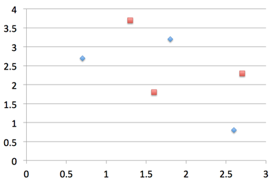
Creation of a bubble chart is very similar, having an additional value for each data point that specifies the bubble size:
버블 차트 생성은 버블 크기를 지정하는 각 데이터 포인트에 대한 추가 값을 갖는 것과 매우 유사하다.
chart_data = BubbleChartData()

series_1 = chart_data.add_series('Series 1')
series_1.add_data_point(0.7, 2.7, 10)
series_1.add_data_point(1.8, 3.2, 4)
series_1.add_data_point(2.6, 0.8, 8)

chart = slide.shapes.add_chart(
    XL_CHART_TYPE.BUBBLE, x, y, cx, cy, chart_data
).chart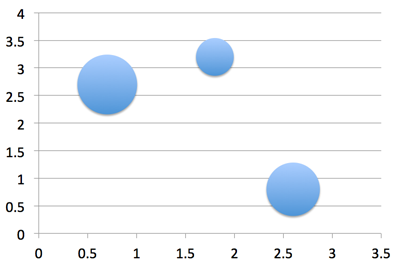
Axes
Let’s change up the category and value axes a bit:
카테고리와 값 축을 약간 변경해 본다.
from pptx.enum.chart import XL_TICK_MARK
from pptx.util import Pt

category_axis = chart.category_axis
category_axis.has_major_gridlines = True
category_axis.minor_tick_mark = XL_TICK_MARK.OUTSIDE
category_axis.tick_labels.font.italic = True
category_axis.tick_labels.font.size = Pt(24)

value_axis = chart.value_axis
value_axis.maximum_scale = 50.0
value_axis.minor_tick_mark = XL_TICK_MARK.OUTSIDE
value_axis.has_minor_gridlines = True

tick_labels = value_axis.tick_labels
tick_labels.number_format = '0"%"'
tick_labels.font.bold = True
tick_labels.font.size = Pt(14)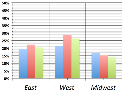
Okay, that was probably going a bit too far. But it gives us an idea of the kinds of things we can do with the value and category axes. Let’s undo this part and go back to the version we had before.
값 축과 범주 축을 사용하여 수행할 수 있는 작업의 종류에 대한 아이디어를 제공한다. 이 부분을 실행 취소하고 이전 버전으로 돌아간다.
Data Labels
Let’s add some data labels so we can see exactly what the value for each bar is:
각 막대의 값이 정확히 무엇인지 확인할 수 있도록 몇 가지 데이터 레이블을 추가해 본다.
from pptx.dml.color import RGBColor
from pptx.enum.chart import XL_LABEL_POSITION

plot = chart.plots[0]
plot.has_data_labels = True
data_labels = plot.data_labels

data_labels.font.size = Pt(13)
data_labels.font.color.rgb = RGBColor(0x0A, 0x42, 0x80)
data_labels.position = XL_LABEL_POSITION.INSIDE_END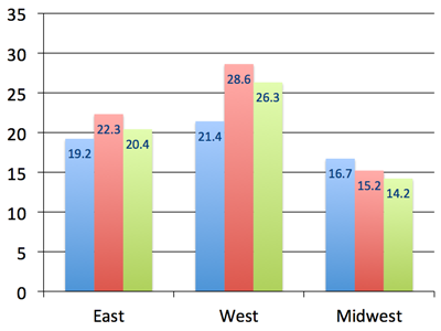
Here we needed to access a Plot object to gain access to the data labels. A plot is like a sub-chart, containing one or more series and drawn as a particular chart type, like column or line. This distinction is needed for charts that combine more than one type, like a line chart appearing on top of a column chart. A chart like this would have two plot objects, one for the series appearing as columns and the other for the lines. Most charts only have a single plot and python-pptx doesn’t yet support creating multi-plot charts, but you can access multiple plots on a chart that already has them.
In the Microsoft API, the name ChartGroup is used for this object. I found that term confusing for a long time while I was learning about MS Office charts so I chose the name Plot for that object in python-pptx.
여기서는 데이터 레이블에 액세스하려면 Plot 객체에 액세스해야 했다. 플롯은 하나 이상의 계열을 포함하고 열이나 선과 같은 특정 차트 유형으로 그려지는 하위 차트와 같다. 이러한 구별은 세로 막대형 차트 위에 표시되는 꺾은선형 차트와 같이 두 가지 이상의 유형을 결합하는 차트에 필요하다. 이와 같은 차트에는 두 개의 플롯 개체가 있다. 하나는 열로 표시되는 계열에 대한 것이고 다른 하나는 선에 대한 것이다. 대부분의 차트에는 단일 플롯만 있고 python-pptx는 아직 다중 플롯 차트 생성을 지원하지 않지만 이미 차트가 있는 차트에서 여러 플롯에 액세스할 수 있다.
Microsoft API에서는 이 개체에 ChartGroup이라는 이름이 사용된다. MS Office 차트에 대해 배우는 동안 오랫동안 그 용어가 혼란스럽다는 것을 알았기 때문에 python-pptx에서 해당 개체에 대해 Plot이라는 이름을 선택했다.
Legend
A legend is often useful to have on a chart, to give a name to each series and help a reader tell which one is which:
범례는 차트에 포함하여 각 계열에 이름을 지정하고 독자가 어느 계열인지 구분하는 데 도움이 되는 경우가 많다.
from pptx.enum.chart import XL_LEGEND_POSITION

chart.has_legend = True
chart.legend.position = XL_LEGEND_POSITION.RIGHT
chart.legend.include_in_layout = False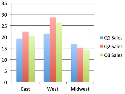
Nice! Okay, let’s try some other chart types.
다른 차트 유형을 시도해 본다.
Line Chart
A line chart is added pretty much the same way as a bar or column chart, the main difference being the chart type provided in the add_chart() call:
꺾은선형 차트는 막대형 또는 기둥형 차트와 거의 같은 방식으로 추가된다. 주요 차이점은 add_chart() 호출에서 제공되는 차트 유형이다.
chart_data = ChartData()
chart_data.categories = ['Q1 Sales', 'Q2 Sales', 'Q3 Sales']
chart_data.add_series('West',    (32.2, 28.4, 34.7))
chart_data.add_series('East',    (24.3, 30.6, 20.2))
chart_data.add_series('Midwest', (20.4, 18.3, 26.2))

x, y, cx, cy = Inches(2), Inches(2), Inches(6), Inches(4.5)
chart = slide.shapes.add_chart(
    XL_CHART_TYPE.LINE, x, y, cx, cy, chart_data
).chart

chart.has_legend = True
chart.legend.include_in_layout = False
chart.series[0].smooth = True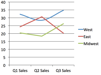
I switched the categories and series data here to better suit a line chart. You can see the line for the “West” region is smoothed into a curve while the other two have their points connected with straight line segments.
꺾은선형 차트에 더 잘 맞도록 여기에서 카테고리와 계열 데이터를 전환했다. "서쪽" 영역의 선이 곡선으로 부드럽게 처리되고 다른 두 영역의 점이 직선 세그먼트로 연결되어 있는 것을 볼 수 있다.
Pie Chart
A pie chart is a little special in that it only ever has a single series and doesn’t have any axes:
원형 차트는 단일 계열만 포함하고 축이 없다는 점에서 조금 특별하다.
chart_data = ChartData()
chart_data.categories = ['West', 'East', 'North', 'South', 'Other']
chart_data.add_series('Series 1', (0.135, 0.324, 0.180, 0.235, 0.126))

chart = slide.shapes.add_chart(
    XL_CHART_TYPE.PIE, x, y, cx, cy, chart_data
).chart

chart.has_legend = True
chart.legend.position = XL_LEGEND_POSITION.BOTTOM
chart.legend.include_in_layout = False

chart.plots[0].has_data_labels = True
data_labels = chart.plots[0].data_labels
data_labels.number_format = '0%'
data_labels.position = XL_LABEL_POSITION.OUTSIDE_END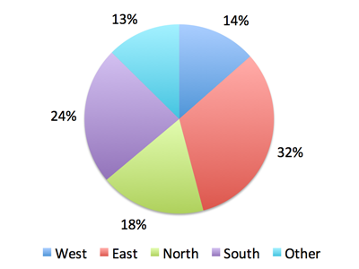
Odds & Ends
This should be enough to get you started with adding charts to your presentation with python-pptx. There are more details in the API documentation for charts here: Charts
이것은 python-pptx를 사용하여 프레젠테이션에 차트를 추가하는 데 충분하다. 차트에 대한 API 문서 Charts에 자세한 내용이 있다.
About colors
By default, the colors assigned to each series in a chart are the theme colors Accent 1 through Accent 6, in that order. If you have more than six series, darker and lighter versions of those same colors are used. While it’s possible to assign specific colors to data points (bar, line, pie segment, etc.) for at least some chart types, the best strategy to start with is changing the theme colors in your starting “template” presentation.
기본적으로 차트의 각 계열에 할당된 색상은 테마 색상 Accent 1부터 Accent 6까지 순서대로 지정된다. 시리즈가 6개 이상인 경우 동일한 색상의 더 어둡고 밝은 버전이 사용된다. 적어도 일부 차트 유형에 대해 데이터 포인트(막대, 선, 원형 세그먼트 등)에 특정 색상을 할당하는 것이 가능하지만 시작하는 가장 좋은 전략은 시작 "템플릿" 프레젠테이션에서 테마 색상을 변경하는 것이다.
Python/python-pptx 사용자 가이드 - 12. Tables
Python/python-pptx 사용자 가이드 - 12. Tables
https://python-pptx.readthedocs.io/en/latest/user/table.htmlWorking with tablesPowerPoint allows text and numbers to be presented in tabular form (aligned rows and columns) in a reasonably flexible way. A PowerPoint table is not nearly as functional as an
summertrees.tistory.com
Python/python-pptx 사용자 가이드
Python/python-pptx 사용자 가이드 - 1. 소개Python/python-pptx 사용자 가이드 - 2. 설치Python/python-pptx 사용자 가이드 - 3. 시작Python/python-pptx 사용자 가이드 - 4. 프리젠테이션Python/python-pptx 사용자 가이드 - 5.
summertrees.tistory.com
728x90'코딩 > Python' 카테고리의 다른 글
Python/python-pptx 사용자 가이드 - 13. Notes (1) 2024.06.12 Python/python-pptx 사용자 가이드 - 12. Tables (0) 2024.06.12 Python/python-pptx 사용자 가이드 - 10. Text (2) 2024.06.12 Python/python-pptx 사용자 가이드 - 9. Placeholder 2 (0) 2024.06.12 Python/python-pptx 사용자 가이드 - 8. Placeholder 1 (0) 2024.06.06